The Kyoto National Museum was established in 1897 as an institution for the collection and preservation of cultural properties. As an important cultural institution, longevity was a trait that was at the forefront when rebranding the museum's visual identity.
The new rebranding encompasses a new color palette, typography, patterns, and collateral applications. Along with the aforementioned, the logo was adapted into a logo animation for video media use.
Developed a rebrand of KNM's logo and visual identity that encompasses the Museum's reputation as a timeless arts & cultural institution along with logo applications and logo animation.
The beginning of the Museum's rebrand was to design an updated logo for the institution's use.
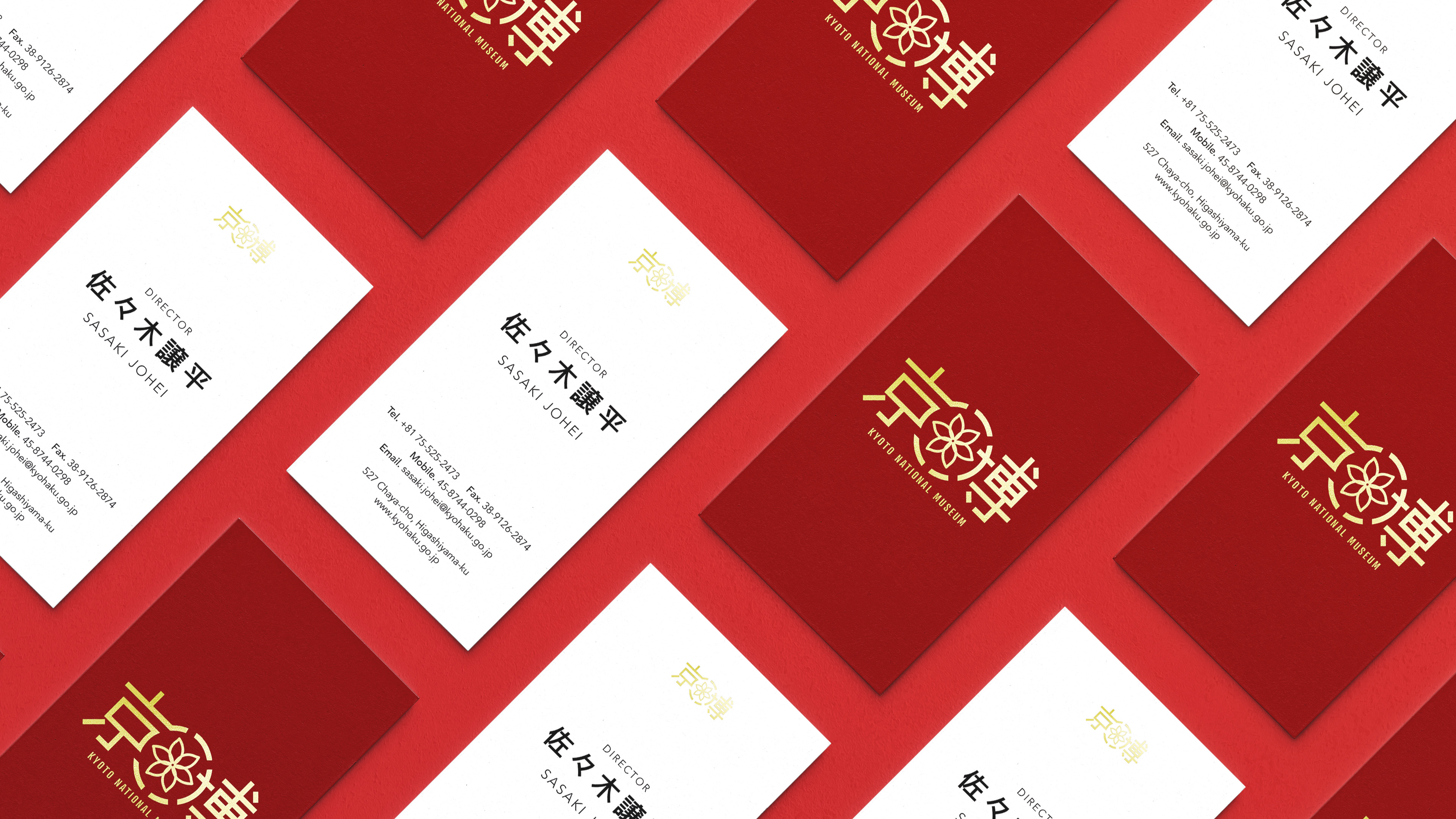
With Kyoto's rich history in gold-foiling and gilding, I decided on the logo to be gold/yellow to reflect the concept. The logo is composed of the kanji for Kyo-Haku – a shorthand for Kyoto National Museum. Located in the center is a 6-pointed lotus, a nod to Kyoto's city flag – further tying the city's identity to the Museum.
The logo was then repurposed into a logo animation with the intention of using the asset for video media.
Logo, brandmark, color palette, and typography were made to round-out Kyoto National Museum's brand identity.
The logo has two application methods, gold-foiled and CMYK printed. To keep appearance, the use of gold-foiled logos is reserved exclusively for business cards while CMYK printed is meant for other clerical applications.
The color and pattern palette is composed to modernize the Museum's visual identity while also providing visual variety for museum collateral.
Further explanation on stylistic choices for the brand identity can be found in the brand style guide located at the bottom of the project page.
To better visualize the application of the logo, mockups of collateral were rendered. This includes double-sided business cards, letterheads, and exhibit brochures.
The exhibit brochures in particular have a unique visual, instead of using the primary red or yellow of the logo they utilize a secondary palette and patterns. The patterns will also be coated in an aqueous matte varnish to give the brochures an elevated look.
Further explanation on stylistic choices for the collateral can be found in the brand style guide located at the bottom of the project page.